Panel Layout Episode 09

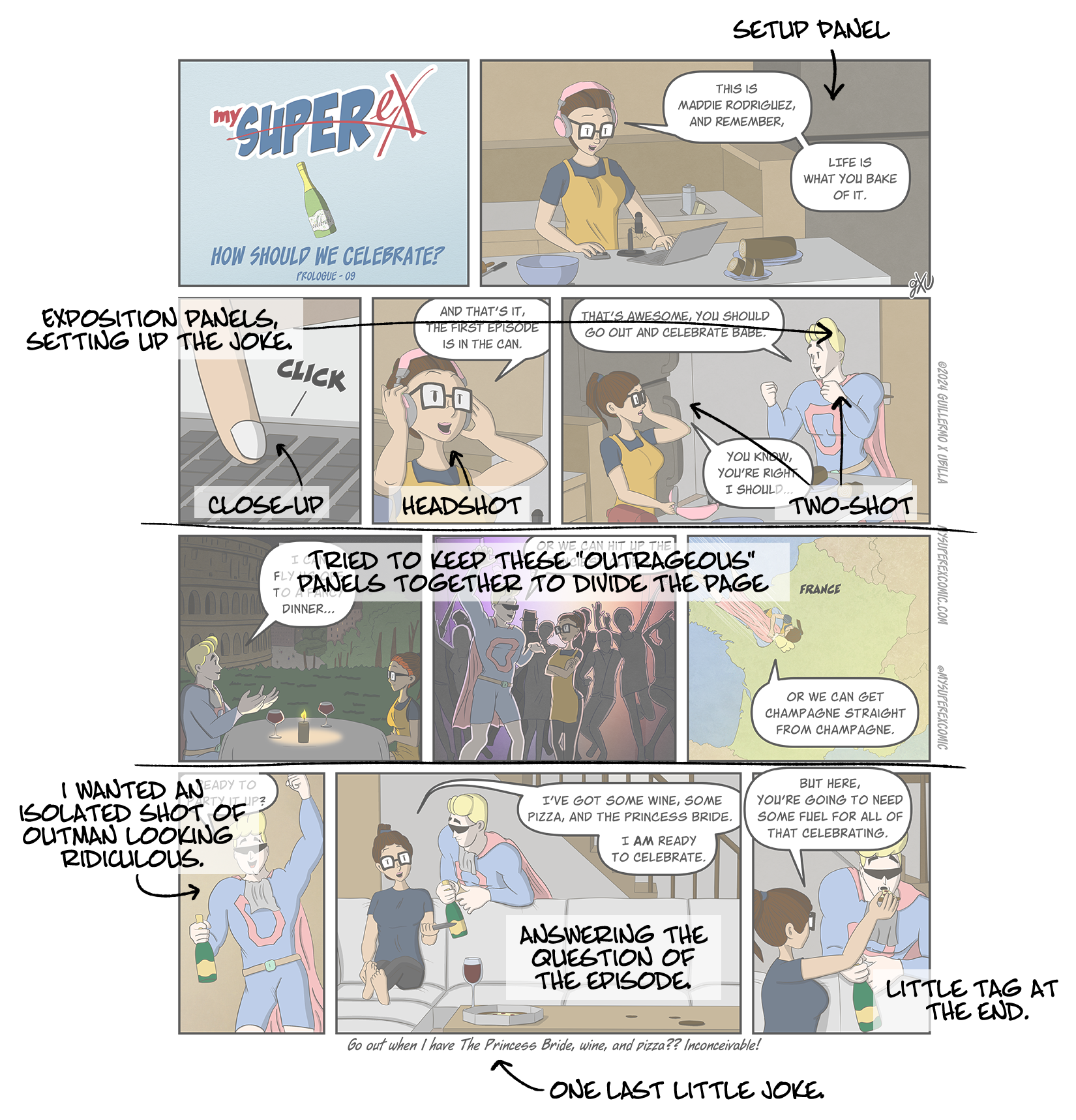
Laying out a comic page that works in three different formats has its challenges. Today, I thought I’d walk you through my process for this week’s page.

I keep a consistent title panel for the Prologue comics, which leaves me a little over half a row to set up the comic. This week, I used a medium shot to show Maddie in her environment, finishing up recording her first episode.

Row 3 is where the fun happens, showcasing Outman’s different celebration suggestions. So, row 2 is for exposition. I used a close-up to a two-shot to keep the story moving and set up the celebration panels in the next row.

Thinking about the overall page, I wanted the celebration panels to split the comic’s setup from its conclusion. I made all three panels the same size to create a staccato rhythm for Outman’s suggestions.

In the fourth row, I led into the finish with an isolated shot of Outman looking ridiculous, combining elements from his suggestions. I wanted the panels themselves to help suggest how different Maddie’s idea of celebration was from Outman’s. Outman’s ideas were three smaller panels in a row, while Maddie’s idea of celebration comes across in one long panel. Finally, there’s a little tag at the end with a final line for one last joke.

If you find this interesting, let me know! I’m new to comics and learning as I go, but I’m happy to share my thought process along the way.

Script to Panel Episode 08

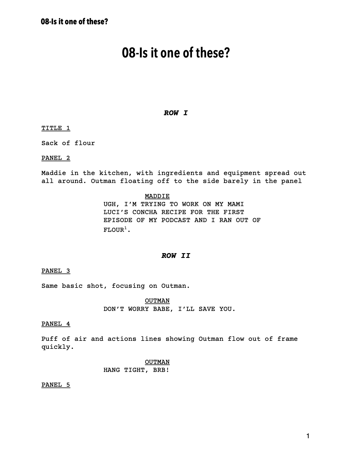
Working on my first comic solo has been a whirlwind of figuring out what’s a good use of time and what might be a waste. One big question I had was whether to write a full script for each episode. From what I gather, many comic artists who write and illustrate their work don’t always do this.

I started scripting for a couple of reasons. As a newbie, I thought it would help me fully flesh out my ideas before diving into the time-consuming drawing phase. This way, any changes could be made during writing, saving time and effort later. It also allowed me to get feedback on the episode’s storyline before committing to the artwork.

Since I write and draw each episode, you’ll notice the panel descriptions are more sparse than if another artist were involved. Additionally, I sometimes tweak the dialogue on the fly to fit the space better once the word balloons are laid out.

As I dive into writing the first chapter, I’m still deciding whether to stick to this full scripting process or try something quicker. What do you think?

Choosing character colors: Outman

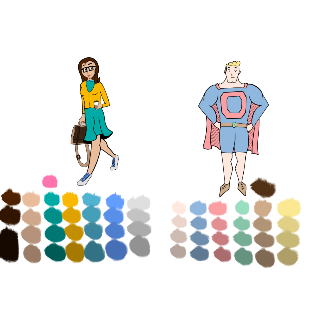
Creating the color palette for Outman was one of the first things I tackled when designing the My Super Ex characters. Since I wanted him to always be in his superhero outfit, unlike the other characters who would change clothes regulary, I took my time to get the colors just right.

I set myself two goals with his color palette. First, I wanted him to be instantly recognizable as a superhero, but not your typical one. So, I started with the traditional blue and red spandex uniform that universally signals “superhero.” However, I knew I needed to tweak the shades to make him stand out from the norm. Second, I wanted his palette to reflect his personality. Originally, Outman was conceived as a more “bro-y” character—always ready to party and a bit self-involved. In my sketches, I noted that college parties were the best time of his life, and he idolized the frat guys from ’80s and ’90s comedies.

As I gathered references, three things stood out: pastels, shorts, and boat shoes. None of the images I collected featured primary colors; instead, they were filled with pastels. Shorts and boat shoes were also a recurring theme. So, I incorporated these elements, transforming the primary blue and red into pastel versions and dressing him in shorts and boat shoes.

Although Outman’s personality has evolved over the past two years, I still think his color scheme fits his character perfectly. I’m pleased with how it turned out and think it continues to represent him well.

What it takes to share in three formats

I’m working to making “My Super Ex” as readable as possible regardless of how people want to read the comic. I’m making each comic in a unique format:

📖 Page Layout: Perfect for print and large screens, where you can see all the panels at once.

📱 Mobile Layout: Designed for smaller screens, allowing you to swipe through one panel at a time.

📜 Webtoons Format: Ideal for smartphones, letting you scroll through the episode in a continuous vertical format.

Each format requires a different number of files to create one issue. Even though each episode is different, the images show about how many files are needed for each format. And each episode includes a few extra assets to round out the presentation for each layout. The goal is to make sure you can enjoy the story no matter where or how you’re reading it!

How Things Have Changed

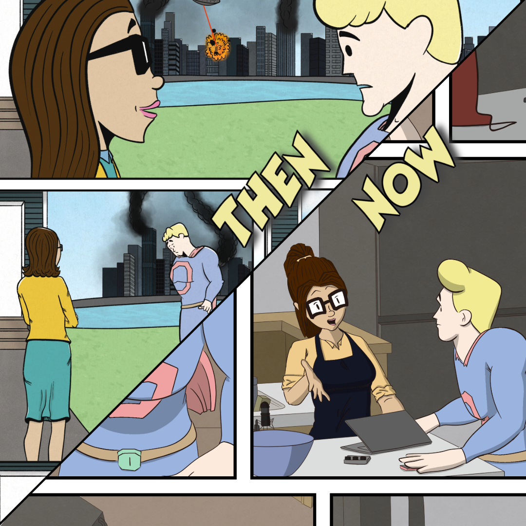
I’ve been working on this webcomic for over two years, and after going through thousands of drawings and sketches, I came across the original character drawings. It’s amazing to see how far I’ve come since then, and I’ve found it important to pause and appreciate the progress and improvements that come with consistent work. Even though I’m usually busy with the production of the next episode, reflecting upon the evolution of the work is always a good idea.