
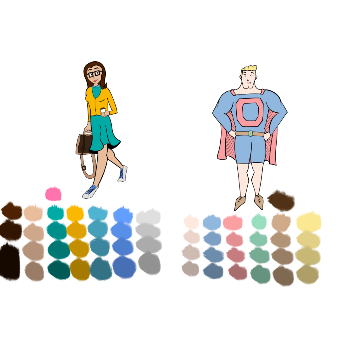
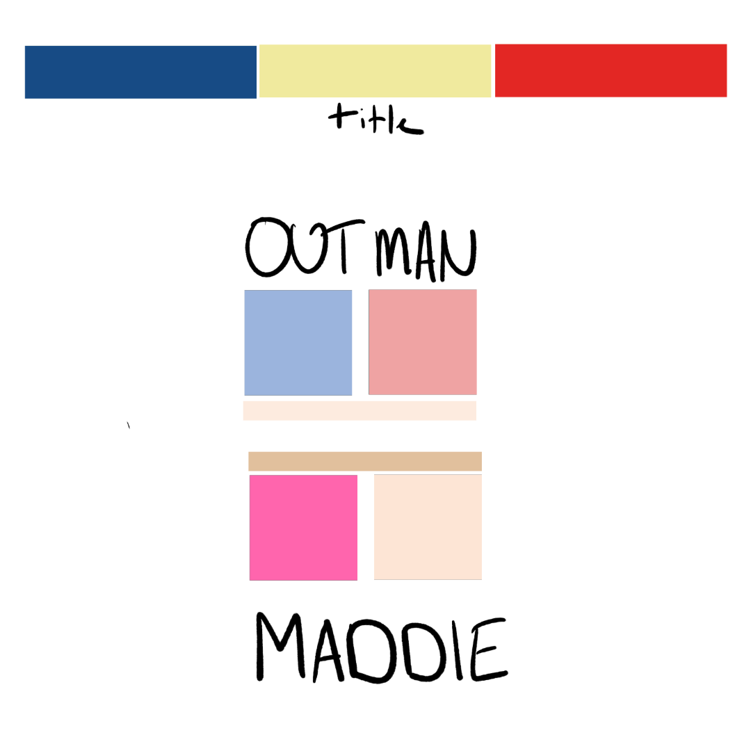
Creating the color palette for Outman was one of the first things I tackled when designing the My Super Ex characters. Since I wanted him to always be in his superhero outfit, unlike the other characters who would change clothes regulary, I took my time to get the colors just right.
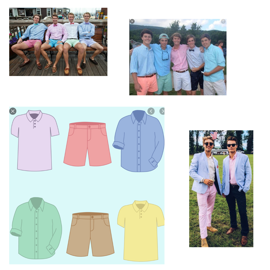
I set myself two goals with his color palette. First, I wanted him to be instantly recognizable as a superhero, but not your typical one. So, I started with the traditional blue and red spandex uniform that universally signals “superhero.” However, I knew I needed to tweak the shades to make him stand out from the norm. Second, I wanted his palette to reflect his personality. Originally, Outman was conceived as a more “bro-y” character—always ready to party and a bit self-involved. In my sketches, I noted that college parties were the best time of his life, and he idolized the frat guys from ’80s and ’90s comedies.
As I gathered references, three things stood out: pastels, shorts, and boat shoes. None of the images I collected featured primary colors; instead, they were filled with pastels. Shorts and boat shoes were also a recurring theme. So, I incorporated these elements, transforming the primary blue and red into pastel versions and dressing him in shorts and boat shoes.
Although Outman’s personality has evolved over the past two years, I still think his color scheme fits his character perfectly. I’m pleased with how it turned out and think it continues to represent him well.